Today is Figma with breakfast at Simes Kitchen in Kaikoura,
I continue on from yesterday’s initial bit of design work on the home page. Even though the sites design space is extremely small at this point, I know from working with component based UI how important it is to formally “componentise” UI designs early. For example if tags end up everywhere throughout the Figma file, and I eventually want to change the font size of all tags, manually hunting down each instance would be a design headache.
I have very little experience with Figma from the perspective of actually doing the design, so I am finding my way. While overall the process is relatively easy, I had two main takeaways:
Auto layouts are your go-to
Coming from a web development background, I’m used to the CSS Box model, where content adjusts to its container in a predictable way. For example, a paragraph of text will wrap when it reaches the width of its parent. In Figma, auto layouts work much the same way. When auto layout is enabled child elements can automatically expand or contract to fill the parent container.
Further, Auto Layout acts like flexbox in CSS. You can adjust gaps between child elements, the direction of the layout and alignment of elements within the layout. This makes it natural to design from a web development perspective catering for responsivity and reuse of components in different contexts within the design.
Component limitations
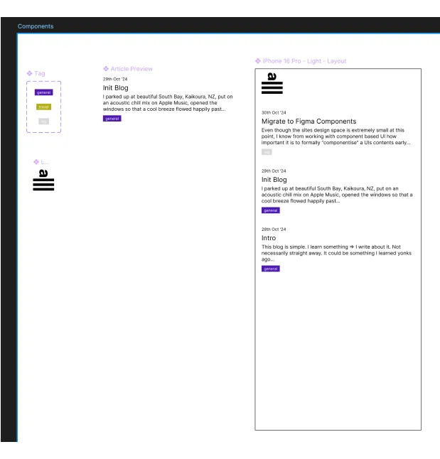
In web development components usually support the concept of “slots” or “children”: placeholder areas within the component where other components can later dynamically be placed. Along these lines, I wanted to design a “Layout” component that would display multiple
After a bit of digging, it seems that Figma doesn’t currently support dynamic “slot” functionality. This means Figma’s components are like static templates that can have their styling adjusted, but not their internal structure. Instead, you need to fall back to using basic “Frames” (Figma’s standard boxes that you design within) for areas that need to accomodate dynamic children.
As a result of these findings, I created just three components—Logo, Tag, and ArticlePreview—and used a basic frame with auto-layouts to combine them into the overall mobile design. Some tedium may arise in the future, but it’s good enough for now. A good cleanup and a great start to the day!
Time spent: ~90 mins